Day 1: Orientation
Today is the first day of the program. It consisted of an hour long orientation presentation and a dinner to get acquainted with our peers.
Day 2: Classes Begin!
I am participating in the Graphic Design program. Today we met in the Arts and Science building Room 203 with our instructor Mr. Michael McGarvey who is a Professor here at Richard Stockton College. Michael has been working with the graphic arts since the 80's.

The computer lab is beautiful! Look at these Mac's! :) I love the large monitors, the tiny keyboards and the pen mouse pads. I would be beyond excited if we could get a lab like this at my middle school.

We were also given some supplies to work with for the week. I love art supplies!

After getting to know a little bit more about our instructor and classmates, we began with learning the program Adobe Illustrator. We spent the entire morning learning a variety of tools and techniques. Toward the end of the morning session, we were given our first assignment: create 2 sketches, one of a manmade object and one of a natural object. I chose a bicycle and a bird. Getting to know the various tools was a great way to introduce Illustrator. That is how I teach Photoshop to my students. However, when it came to Illustrator, I wasn't sure how to use all the tools because I haven't used them since college and I had no idea where my jumping off point should be.

After an hour long lunch, we reported back to Room 203 and used Illustrator to create our designs on the computer. It's important to teach students that they should be creating original artwork, rather than stealing art from the Internet to use in their projects. The tools we learned this morning is a great way for students to create original artwork from their sketches (the only downside is that that this could take a few weeks in my class...not one day!).

Day 3
Today we learned a several more techniques in Illustrator and how to print. We applied the techniques we learned by creating a composition utilizing Pattern and Rhythm. We experimented with variations of position, direction, rotation, and reflection. I found that I was drawn to compositions that were symmetrical. Once my students create their original artwork, it will be fun for them to use it in a composition. They will really be able to see all their hard work pay off! It will also help me to Illustrate the Principle of Design: Rhythm. I've always had trouble explaining that one!


After our lunch break, we took a field trip to Stockton's Art Gallery. We viewed art from the "Works on Paper" exhibit which was borrowed from the Noyes Museum in Art in Oceanville, NJ (aTi Participants are invited to a reception at the Noyes Museum later tonight). While at the gallery, Michael explained the different printmaking techniques used to create the displayed artwork. It's amazing how much work goes into creating a single print. It brought me back to the long hours I'd spent in the studio at college digging into wood and etching into metals. Printmaking was not for me, but the results are beautiful.


After our field trip, we returned to class and critiqued our work from the morning session. After our critique, Michael showed us examples of his own artwork and of his students artwork. The prints he has created are very intricate and beautiful. I also enjoyed seeing the books his students created and hope that we learn how to do that!!!
At the end of the day, we were given a homework assignment to create 20 sketches. We are to design an image for a word. I completed sketches for a few different words and then narrowed my choice down to the word "wine." I have my students create 6 sketches before doing a logo design and they act like I've gone crazy, I can't wait to tell them we had to create 20. They will probably fall off their chairs. hahaha

Day 4
We began class by displaying and discussing our homework assignment. Michael gave a demonstration on how to work with the Type tool. After advisement from our Instructor, we got to work on our designs. Here is my design for the word "wine." I decided to arrange the letters of the word wine to form a wine glass.
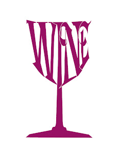

The two images should read together as "Wine Bottle."

With the extra time I had, I created an image using the word "Bottle."


Day 5
Today we learned to print and mount our images. We were also given the option to choose a project to work on. Before I printed, I decided to rework my design. The mounting process is simple, but makes a huge impact on how the finished piece presents. I would LOVE to have my students mount their own work. First thing I will need to do is order a mat cutter. However, I'm not sure if it will be practical with the number of students I have (25-30) and the length of a class period (60 mins). It may be something that is more suited for a high school level class.

